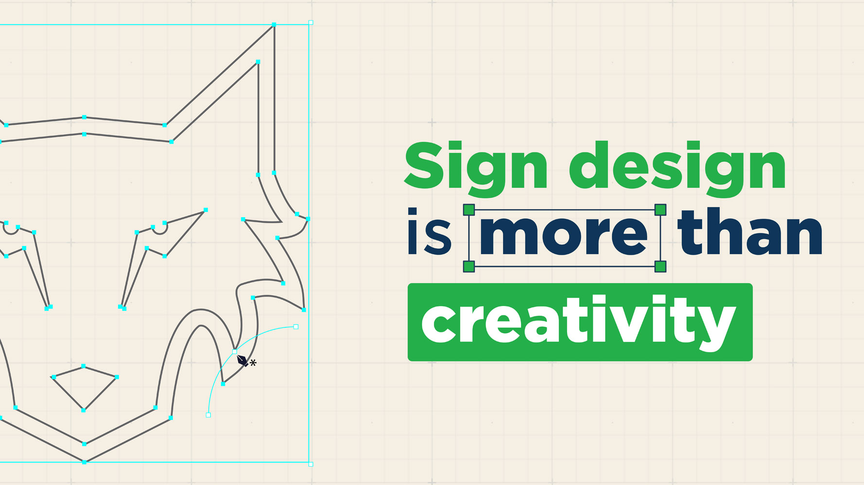
In today’s competitive advertising landscape, effective signage design is essential for capturing attention and delivering meaningful messages. As a vital component of your marketing strategy, signage should be developed through careful planning. When executed well, it can maximize your impact—driving both lead generation and brand building.
In our previous article, What Makes Effective Signage Design? Expert Tips & Methods, we shared valuable insights from industry experts on the key criteria behind effective signage design.
In this article, The Sign Pack highlights several fundamental principles that underpin effective signage design and drive positive business impact. These include:
- Clarity and simplicity
- Strong visual hierarchy
- Clear readability
- Consistent branding elements
- Strategic placement
In addition to explaining these core principles, we will outline common mistakes to avoid during the design process.
Below is a complete breakdown of the essential design principles for effective signage that drives business results, along with the pitfalls to avoid.

Clarity and Simplicity
The first foundation of effective signage design is clarity and simplicity. These elements contribute directly to several critical outcomes, such as:
- Ensuring the message is easy for audiences to understand
- Allowing viewers to process information within seconds
- Deliver essential details clearly so signage creates maximum impact, whether for lead generation or branding.
Effective signage relies on clarity and simplicity. Without these, even visually appealing signs fail to deliver results.
For example, imagine a sign for a local restaurant. A cluttered layout with too much text and too many graphics can overwhelm passersby, making it difficult to recognize the restaurant’s name or the featured offer. In contrast, a clean design with clear text, a compelling image of a signature dish, and concise supporting details will capture attention right away.
Most people generally process visual information using two natural reading patterns:
- The “F” Pattern: Viewers start at the top left, scan across to the right, then move downward.
- The “Z” Pattern: Viewers scan from the top left to the top right, then diagonally down to the bottom left, then move horizontally again.
When your signage design aligns with these natural viewing behaviors, it becomes significantly easier for audiences to capture your message within a short viewing window.
The result is simple yet powerful: your business becomes easier to notice, recognize, and remember.
Common Mistakes to Avoid in Clarity and Simplicity
Below are several common pitfalls related to clarity and simplicity that should be avoided:
- Overly busy design and a chaotic layout: This confuses the audience and prevents them from identifying the key message. A cluttered design undermines the purpose of your signage.
- Too much text or too many graphic elements: This makes it easy for viewers, especially drivers, to miss key details such as your business name or promotional offer.
- No clear primary message: Without a defined focal message, visual hierarchy breaks down, making the sign hard to interpret quickly. Whenever possible, focus on one core message per sign.
| Also Read: Signage Production Process Best Practices (From Design to Fabrication) |

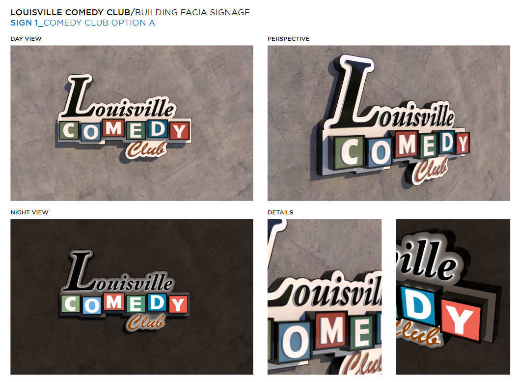
Visual Hierarchy
Visual hierarchy is essential in guiding the viewer’s attention toward the most important elements first. By deliberately using size, color, contrast, spacing, and layout, you can ensure that audiences identify key information quickly and without confusion.
This structured flow of information provides significant benefits in advertising, including signage design, such as:
- Helping audiences absorb information more effectively.
- Enabling businesses to communicate their objectives clearly, whether for lead generation or brand awareness.
- Supporting a consistent brand identity across multiple locations or regions.
- Reinforcing brand recall each time viewers encounter the signage.
In a previous article, we discussed essential rules related to visual hierarchy, particularly for complex signage layouts that include business names, service offerings, promotions, and contact details.
When applying best practices for visual hierarchy in signage, consider the following guidelines:
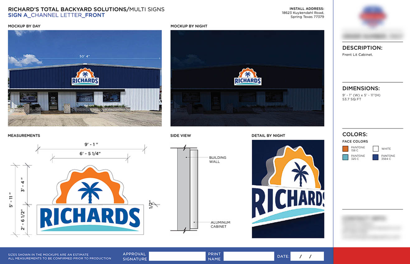
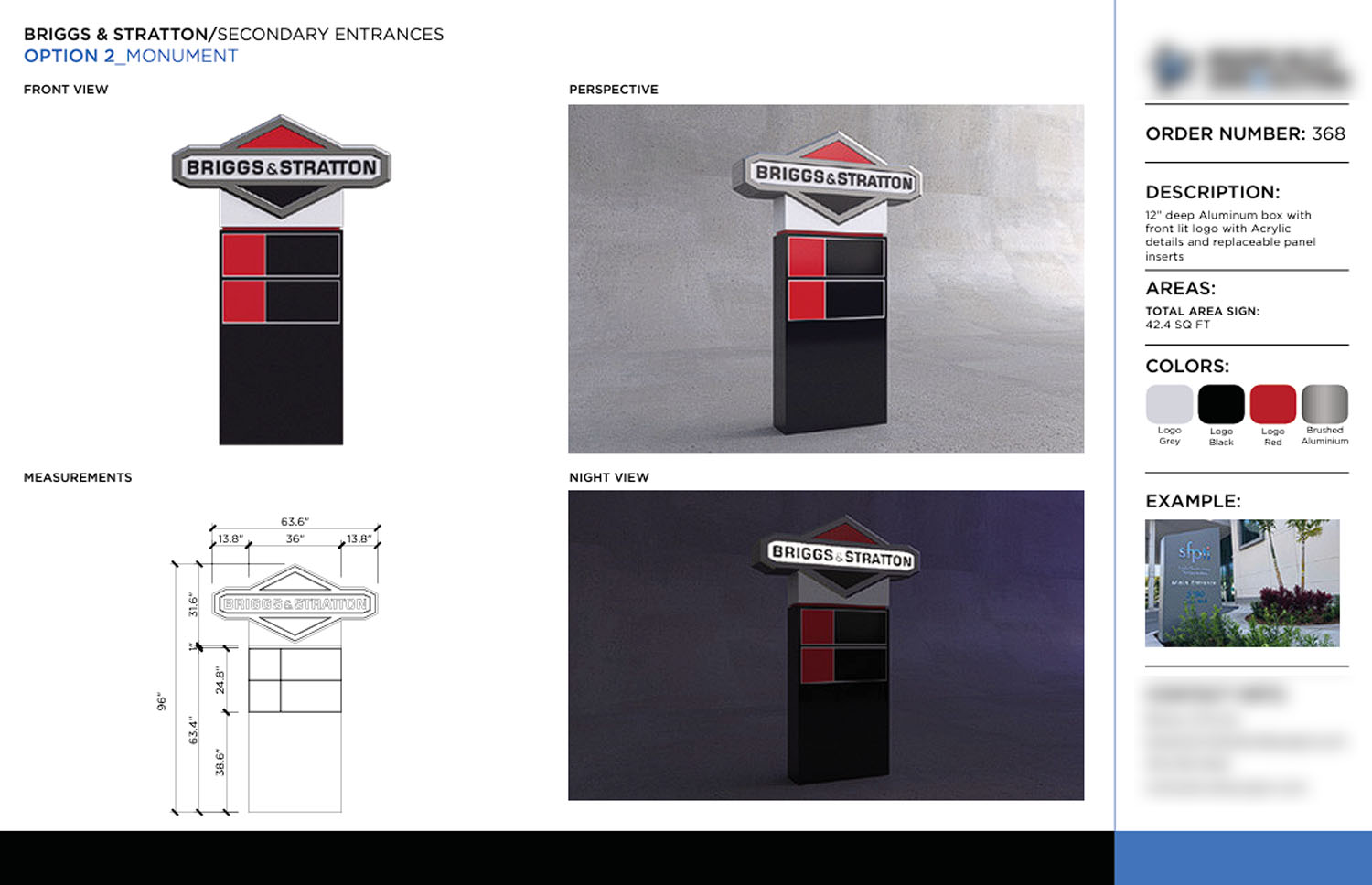
- Who you are (logo and business name): Place this element prominently and ensure it remains visible from a distance.
- What you do (service offering): Communicate this clearly without overwhelming the sign or creating unnecessary clutter.
- How to contact you (website or phone number): Ensure this remains readable and visible from a practical viewing distance.
These principles apply to all types of signage that communicate business information and services. They are especially crucial for signage with lead-generation purposes, such as shopfront signs or vehicle graphics.
We have discussed this more extensively in our article, Why Most Vehicle Branding Designs Fail and the Critical Factors That Determine Success.
Common Mistakes to Avoid in Visual Hierarchy
Below are several mistakes that often undermine the effectiveness of visual hierarchy in signage design:
- Making all elements equally prominent: This prevents viewers from identifying the primary message and creates a cluttered, unprofessional look. Examples include using all-uppercase text or arranging every element at the same visual level.
- Placing primary information in low-visibility areas: This makes your business harder to recognize quickly. For instance, placing the brand name or main message in areas that are difficult to read.
- Oversized logos: An overly large logo can overshadow important information. For example, using a logo or icon that takes up 60–80% of the signage area can be distracting.
- Insufficient white space: A lack of breathing room makes the sign appear cramped, low-quality, and amateurish. White space is critical for readability, visual appeal, and even ease of installation.
- Including too much information: This can overwhelm viewers, causing them to give up before reading the sign. Keep only what is necessary for the immediate viewing context.

Readability and Legibility
Readability refers to how easily viewers can understand text as a whole, while legibility focuses on the visual clarity of each individual character. Both aspects are essential, and their effectiveness depends on several supporting factors, including:
- Color contrast against the background
- Decorative elements surrounding the text
- Lighting conditions and environmental factors
- Font type and font size
- White space, kerning, and letter spacing
- Viewing distance, placement, and vehicle speed of passing traffic
In general, sans-serif fonts offer strong readability and legibility for signage applications. However, designers can still use other font types as long as they consider the factors above and maintain clarity across different viewing conditions.
Industry experts recommend a minimum letter height of one inch for every 25 feet (7.6 meters) of viewing distance.
For a practical example, if your sign is to be viewed from 100 feet away, the letters should be at least 4 inches tall to ensure readability.
It is also important to anticipate the minimum readable distance for different environments. The International Sign Association provides a commonly referenced table for recommended viewing distances.
Speed (MPH) | With Lane Change (in feet) | Without Lane Change (in feet) |
25-30 | 410 | 155 |
35-40 | 550 | 185 |
45-50 | 680 | 220 |
55-60 | 720 | 265 |
| >65 | 720 | 280 |
Minimum Required Legibility Distances in Varying Situations, source: International Sign Association.
Common Mistakes to Avoid in Readability and Legibility
Below are common pitfalls that negatively impact readability and legibility in signage design:
- Poor color contrast: Low contrast makes text difficult to read from a distance, especially during daytime or bright lighting conditions. This also affects viewers with visual impairments or color blindness.
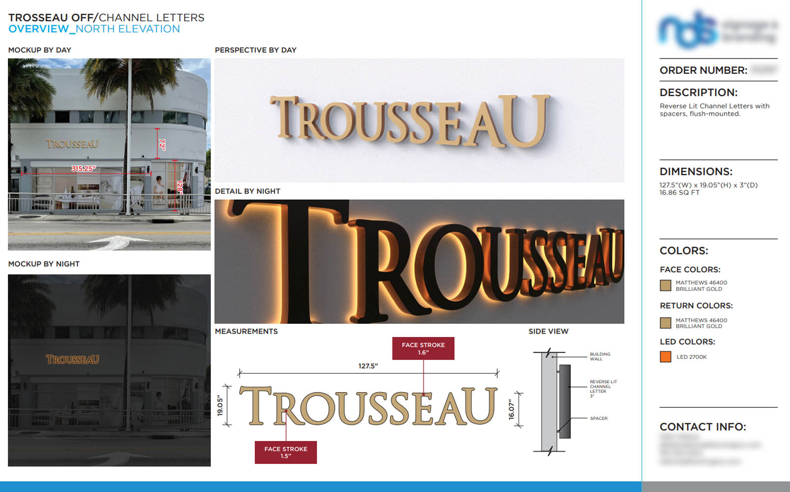
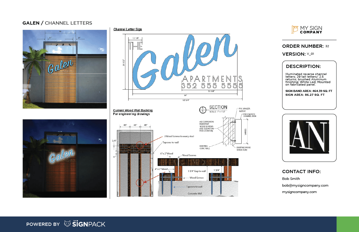
- Using decorative fonts for primary information: Stylized fonts often lose clarity at a distance. For channel letter signs, decorative fonts can appear cramped, distorted, or blurry once illuminated.
- Incorrect font size relative to viewing distance: Text that is too small makes the signage ineffective for road visibility and high-speed environments.
- Placing text in the wrong location: This can make the signage unreadable from certain angles and may cause distortion once installed. Examples include placing text in areas prone to glare, shadows, curves, or physical obstructions.
- Unbalanced width-to-height ratio: When text or the overall layout becomes too wide or too narrow, the sign may appear stretched or compressed, resulting in slower reading speed and reduced comprehension.

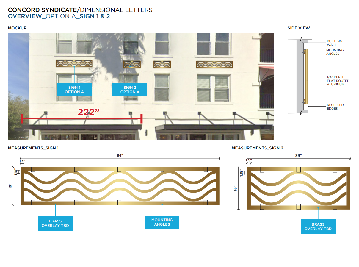
Brand Consistency
Maintaining consistent branding elements across all signage designs strengthens brand recognition and builds a cohesive visual identity. This includes consistency in the use of logos, colors, typography, and overall design aesthetics.
Integrating brand identity consistently into signage delivers several key benefits:
- Reinforces brand awareness and mental availability, helping your client’s brand stay top-of-mind for their audience.
- Creates a cohesive, professional, and memorable brand experience for customers.
- Strengthens brand recall and supports long-term brand building, especially for multi-regional or global companies.
- Builds recognition and fosters customer trust.
On the other hand, inconsistency in branding elements can damage brand integrity and confuse viewers.
The reason is simple: signage is an extension of the brand. Consistently presenting the brand professionally in public spaces makes it easier for people to recognize and remember.
Common Mistakes to Avoid in Brand Consistency
Below are several mistakes that can undermine brand consistency in signage design:
- Using inconsistent colors and fonts: Makes the signage appear off-brand and weakens your visual identity. A common example is replacing brand fonts or colors because they seem “better for signage,” which ultimately weakens brand cohesion.
- Inconsistent logo size and placement: This creates a disorganized brand presentation and diminishes the perceived quality and professionalism of your business.
- Using different visual styles across multiple signs: This disrupts your client’s brand visual voice and confuses customers, making the signage feel disconnected from the brand.

Strategic Placement
Strategic placement is fundamental to maximizing the impact of any signage. No matter how well-designed a sign may be, poor placement will reduce its effectiveness and ultimately waste valuable resources.
- Placing signage in the right location provides several key benefits for businesses:
- Maximizes visibility and ensures the message reaches the right audience.
- Captures the attention of pedestrians and drivers, increasing the chances of attracting new customers.
- Strengthens brand recognition and enhances mental availability.
Imagine placing signage in a high-traffic area or a location frequently visited by your target audience. This naturally increases interaction and improves the sign’s performance. On the other hand, placing signage in hidden or low-visibility areas significantly reduces its impact on business.
The importance of strategic placement is reinforced by findings from the International Sign Association:
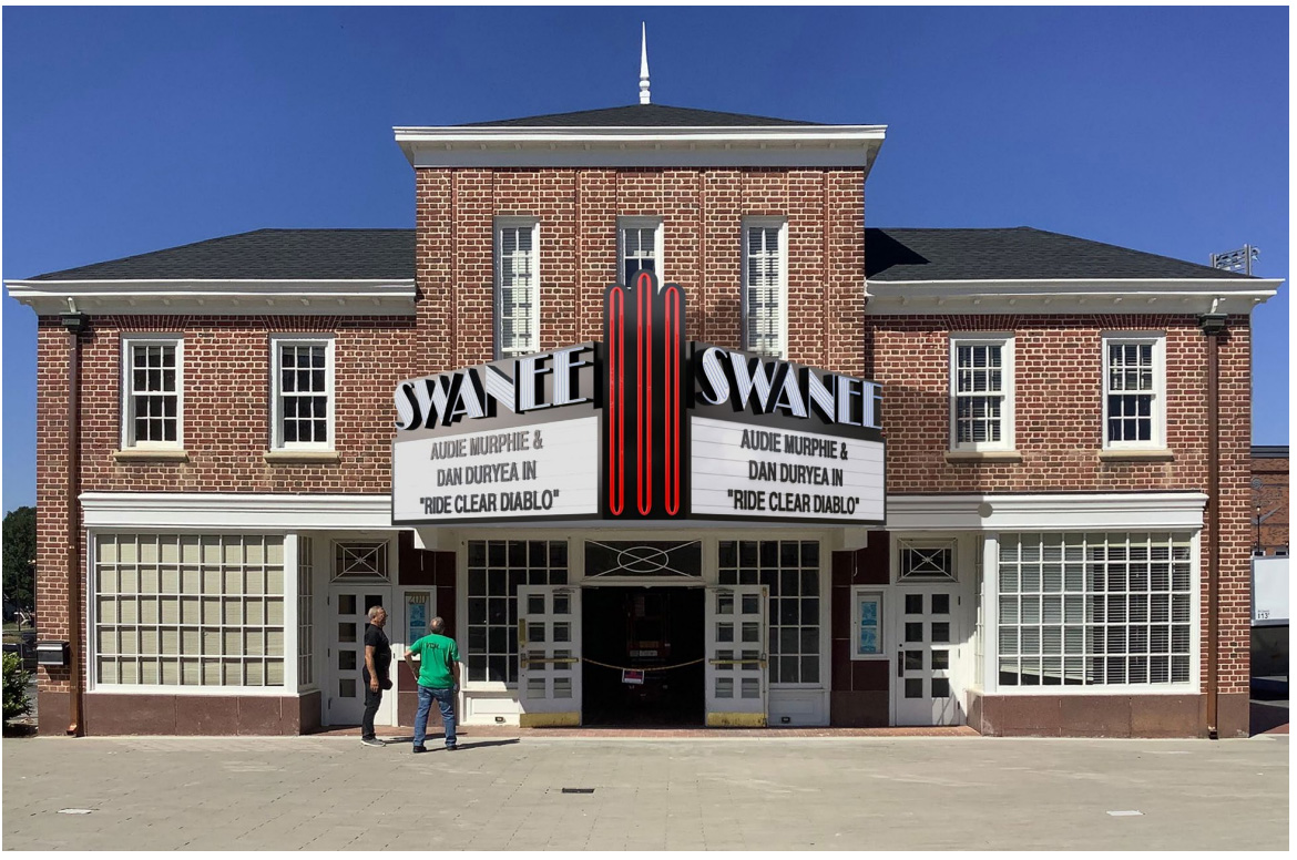
“If a sign is mounted on the front of the building parallel to the roadway, research shows it needs to be at least 70% larger than the sign mounted perpendicular to the roadway, or it cannot be read in time.”
This highlights the importance of conducting thorough research before starting a signage project. Understanding the site, viewing angles, traffic flow, and environmental conditions helps ensure your signage design is optimized for its intended location.
For a more detailed overview of this process, you can visit our article on Signage Production Process Best Practices.
Common Mistakes to Avoid in Signage Placement
Below are common errors that often reduce signage effectiveness:
- Placing signage in obstructed areas: This can make it difficult to see for much of the day due to obstacles such as trees, utility poles, awnings, or other structures.
- Ignoring sightlines: When placement does not align with natural viewing angles, the sign becomes unreadable within the crucial 1–3 second window. Examples include placing a sign too high, too low, too small, or in a direction that traffic does not naturally face.
- Areas with glare: Excessive light or glare reduces visibility, especially if the signage faces direct sunlight, is illuminated incorrectly, or uses glossy materials in reflective environments.
- Too close to other visual elements: This creates visual noise and reduces message clarity. Examples include installing signage near crowded banners, posters, or other busy visual elements.
- Ignoring viewing distance and traffic speed: Customers often see signage while traveling in fast-moving vehicles. If placement and design do not account for this, your signage will be far less effective.
These are key design principles for effective signage that drive business impact. While there are many more guidelines and considerations beyond what we’ve covered here, these core principles provide a strong foundation for producing high-performing signage.
If you are a sign designer or sign shop manager facing a heavy workload and seeking solutions to boost productivity, we can assist you.
The challenges associated with implementing effective signage design principles, such as clarity, visual hierarchy, readability, brand consistency, and strategic placement, can be daunting. Our service is designed to address these specific challenges, ensuring your signage design process is efficient and impactful.
The Sign Pack is a B2B Sign Design Company that provides complete design support for sign shops operating locally, nationally, and globally. With more than 50 combined years of industry experience, we can seamlessly integrate into your professional team.

How The Sign Pack Helps Boost Your Sign Business Productivity
At The Sign Pack, we understand that sign companies worldwide often face high turnover. At the same time, increasing workloads demand fast, reliable, and professional solutions.
So what solutions does The Sign Pack offer to sign companies globally?
- We act as an extension of your team, helping you complete signage projects quickly and professionally.
- We have a team of 100+ specialized signage experts with deep knowledge across all major sign types.
- You gain experienced manpower instantly, ensuring consistent design quality without the long hiring and training process.
- Our modern, scalable platform allows us to manage thousands of projects simultaneously, ensuring smooth workflow even during peak seasons.
- We help sign companies increase productivity and profitability without increasing headcount.
Every design we create follows your brand guidelines, so your clients will always see the work as coming directly from your company.
While you focus on sales, operations, and acquiring high-margin clients, we support your team by delivering complex signage projects seamlessly in the background.
If you’re interested in learning how The Sign Pack can help elevate your business and position you as a leader in the signage industry, our team is ready to assist.
Contact our professional team today to explore the full solution.